EDDIE ROSS
Astronomy in the City
University of Birmingham Observatory
Logo
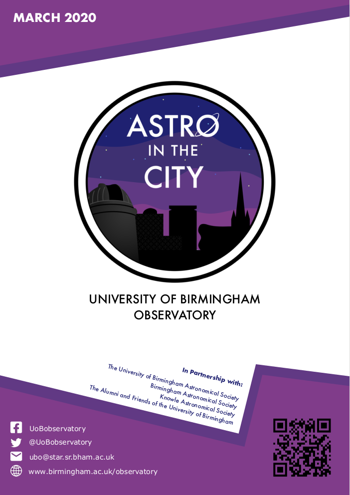
In this project, I updated the logo for the University of Birmingham Observatory's Astronomy in the City events. The new logo is an emblem which shows the night sky, Birmingham skyline, and the name of the event. I gave the "o" in astro a ring to denote either planetary rings, or orbits. The old colour-scheme used purples, so I've kept the heritage , but used more saturated colours than the old logo, to make it feel more modern. The design choices were to improve the readability of the event, which has been achieved using a clean Futura font (also tying in the space theme - as this was the NASA Apollo font).
On the left-hand-side is the University of Birimngham logo, which is in grey and when you look closely has some definition; the observatory is angled in such a way that you might think it was looking at the "o". In additon, the Birmingham city skyline is in the background and in black, paying homage to Birmingham. I did this to give the emblem some depth, but to esnure it was not too complicated and still appreciated when smaller.
I really like that this new logo has a modern feel about it, and the emblem nature of the design means it can be nicely put onto merchandise, such as badges and stickers.
Programme
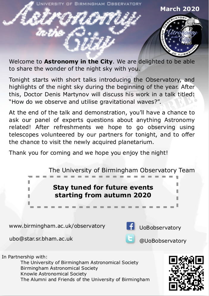
In this project, I also updated the programme booklet for the University of Birmingham Observatory's Astronomy in the City events. The old programme was tired, outdated, and relally busy. The ambition was to breathe new life into it. In the images below, we have the front cover for the old programme (left) and new programme (right).
The programme was made in Pages, as this was the software originally use and it needed remain user-friendly to make edits for new issues. Throughout programme I've included the colour-scheme used in the logo. Separating out lots of the information from the front page makes the programme more inviting. Other design features throughout included removing the clutter of low-opacity background images, and the variety of fonts used. This all helped to make the programme cleaner in appearance and more modern.